Hey, if you flick your eyes back and forth real fast, it’s like a strobe light!
Post Content
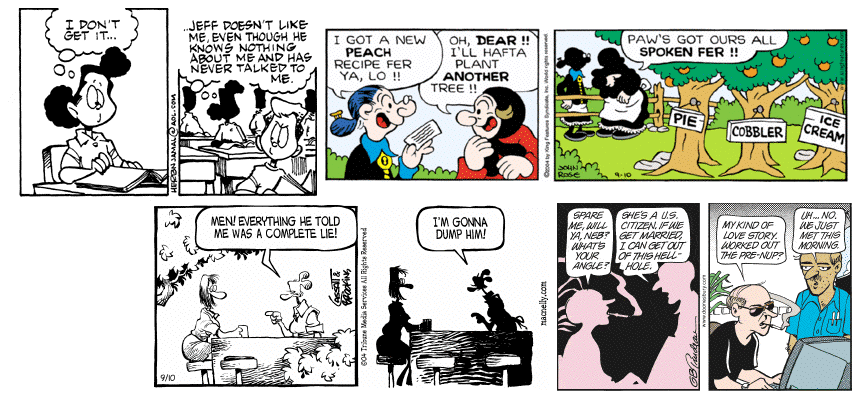
Panels from Herb and Jamaal, Barney Google and Snuffy Smith, Shoe, and Doonesbury, 9/10/04

One of the many things about Gary Trudeau that I like is that he’s admitted that, at least initially, he wasn’t very good at drawing. A lot of early Doonesburys consisted of one character sitting in front of the TV for four consecutive identical panels, and while there was a certain pop-art charm to this, I think most people would agree that his strip has improved leaps and bounds since then, especially after his extended early-1980s sabbatical.
Anyway, for me, one of the defining features of modern-era Doonesbury is the “shadow panel,” where the characters are rendered as white against a black background (or vice versa) for a single panel. This is a technique that has spread in one form or another to other comics as well (or maybe it was always there, though Doonesbury is where I noticed it first). It’s kind of arty, and like a lot of art, I don’t have a clue what it’s supposed to mean. I think it’s safe to say that it doesn’t represent a momentary shift in ambient light, or a massive nearby explosion. Sometimes, as in both Herb and Jamaal and Barney Google and Snuffy Smith today, it’s part of a shift in perspective, generally representing something too far away to render details. (Though I should point out that in Barney Google and Snuffy Smith, the shadowy characters are not, in fact, too far away to render details; in fact, with their white hands, they look alarmingly like Aunt Jemima figurines.) With the other two, though, we’re looking at the same scene from essentially the same angle, so it’s representing … what, exactly? Time passing? A change in scene? A desire to not draw the same damn details on the same characters for a third time in one day? Anyone who knows more about drawing comics than I do (and Lord knows there must be enough of you out there) should please edify us all.

